Hi everybody,
Over the last few months, I have begun to come out of my second LEGO Dark Ages. Whereas my first Dark Ages was brought on by “growing up” and having “better things to do” than play with LEGO, the second one was brought on because of a knowing lack of interest in a product that I felt, as many do and have, that had changed to the point of not being what I loved so much anymore.
Any discussion of this type must begin with the recognition that what LEGO created for kids and, as it turns out, adults, has been phenomenal. A simple concept – the building block – taken to a new level in a direction that it had never seen before. Open ended possibilities, thanks to the unique system of play and the incredible amount of forward-thinking that so rarely is witnessed in commercial organizations. As stated so simply in the 1979 LEGO US catalog, “The magic of the LEGO concept is best summed up in one word: flexibility.”
Over the last few years, LEGO has been bitten by the technology bug. On the one hand, this has allowed LEGO to venture into a new and welcome direction with Mindstorms. On the other hand, the many licenses, software products and items such as the Moviemaker sets have probably contributed greatly to the financial troubles LEGO has reported for FY 2000.
Most of all, though, the juniorization of the Legoland sets and the addition of many pieces that replace flexibility with single-purpose elements has hurt the LEGO brand.
The fact that LEGO recognizes a need to “refocus” on their “core business” is encouraging. But this refocusing must be part of a fundamental change back to what made us love the toy and the concept so much. It must reach across every aspect of The LEGO group's products, how they are designed, how they are packaged and how they are marketed and promoted.
Some may argue that the need existed, and still exists, to do things a certain way in order to provide sets at a reasonable price. But price was never an issue when people felt the sets were worth it.
The refocus must start with the product ranges themselves, and their integration and lead-in to one another.
Basic or Universal building sets should include a wide enough variety of pieces for beginning builders to understand the concepts involved with the LEGO system of play. They should include instructions for various models, and the models should inspire creative thinking. As many long-time LEGO enthusiasts can attest, there were many moments during the building of a set when our young minds realized “Aha! That’s how that works!” or “That is such a neat way to use that piece!”
The Universal sets were at their finest with sets like 402 and 404 all the way up through sets like 715. These sets offered a lot of building possibilities and a strong entrée into the LEGOLand / LEGO System themes.
In addition, the original LEGO figures, constructed with the flexible arm elements, should be re-introduced. The desire to add human and other characters into the LEGO play environment is incredibly strong. The “maxi-figs” as they are affectionately called, provide a good way to add figures on a scale that younger builders are capable of matching with their building skills.
Adding mini figures into a set with maxi-figs sets an appropriate scale of a family with a baby. This is something that should be important for young girls – a market segment that LEGO seems to never quite get ahold of. It also goes back to the idea of better integration between the products for younger and inexperienced builders and those who want to create expansive scenes and large models on the mini-fig scale.
The LEGO System, the mini-figure scale sets, must return to the level of detail that LEGO had achieved during the late ‘80s and early ‘90s. I don’t think anybody who loves LEGO products would argue that new elements should not be introduced, but they should offer more flexibility and possibilities, not fewer.
The themes and sub-themes, as we all call them, that LEGO has introduced us to have all but disappeared. LEGO Town doesn’t even exist in the 2001 lineup. Buildings hardly exist anymore. The basic ingredients to build a town are scarcely available. And the core elements needed to build your own vehicles don’t even seem to exist. Of the nearly 70 sets shown in the 2001 in-box catalog, only one has the 1x3 car doors in it, and it’s a three year old set that will soon be discontinued.
By contrast, the catalogs of the ‘80s and early ‘90s were so rich with the themes that we all grew to love…Town, Space, Castle, and Pirates. Sets like 6390 Main Street, 6383 Public Works Center and 6372 Town House allowed us to create the wonderful environments pictured on the pages of your catalogs. Each set, no matter how small or large, contributed to expanding the possibilities of the theme and of the LEGO system of play as a whole.
Today we have only scattered sets that fit into formulaic price / piece count categories within each theme. No effort has been made to keep continuity between the old and the new. The history of LEGOLand, as a play environment, has been lost.
It is very important that LEGO return to the theme-based set design philosophy. And it’s important that these sets be marketed in such a way that makes sense for what they are. I’ve heard people who work for LEGO claim that part of the reason the design of the sets has changed so much is that kids want more action in their toys.
First of all, I never felt like I was missing out on any action with the“old” LEGO sets. The sets allowed me to create the environment in which I dictated the action (or lack thereof, depending on what I built and how I played with it).
Second, LEGO was successful in introducing more action-oriented elements into themes such as Wild West, which didn’t suffer from a lack of detail or creative set design.
Third, the catalogs must also return to a more simplified state. The older style catalogs, where each set is presented in its own little frame, intermixed with the panoramic views of the vast layouts possible with all of the LEGO sets in the theme, were perfect. It was easy to see what each set offered. And it was fascinating to dream of how, once “I had all the sets in the catalog”, I too could have my own LEGO town or lunar environment or medieval kingdom.
And LEGO should not consider civilian-type sets to be “boring”. Even as a kid, I wanted the Town Houses, Holiday Villas, Vacation Campers and other such sets. Main Street is one of the most prized sets in my collection. Recently, I’ve been trying to find more of the houses…the glue that binds the town of race car drivers, astronauts and firemen together. :)
In the ‘80s and early ‘90s, LEGO was very successful at building excitement for new sub-themes by integration of the new sets with the old, mostly due to the scenes presented in the catalogs. Houses, hotels, fire departments and auto repair shops stood along side each other.
Space Police chased the Blacktron rebels. The Black Monarch and the Black Falcon battled it out while the Forestmen waited in the wings. The various Pirate bands fought each other on the high seas. This integration was only natural, given the average three-year product cycle of LEGO sets, and it worked. Each year, I anxiously opened the newest set to see what magic awaited inside. The last few years, when I got around to it, I’d pick up a small, new set to see if there was anything good in the new catalog.
If LEGO feels the need to make sets less boring, it should do so by adding the type of action elements seen in the Wild West sets, or by using the LEGO System (mini-fig scale) sets to introduce basic Technic elements to perform action-related tasks. Again, this has the benefit of introducing one buying group to another through integration and crossover.
Even many of the Technic sets have become more play-oriented than “engineering” oriented. The Super Car, Mobile Crane, Farm Tractor, Space Shuttle sets…they inspired builders of all ages to think outside the box, turn things on their side and think fresh. They are inspired models and designs that all hold up well.
And LEGO should not discount the importance of its packaging. It is impossible to store small sets in their boxes (without using an inner back, etc.) because the flaps don’t stay closed and the pieces fall out. In the ‘70s, small sets came in a much more usable box with a traditional tab and slot design that actually worked and stayed closed.
Medium and large sets should return to the box flap / cardboard tray scheme. Large sets today must be stored horizontally due to the box cover that doesn’t fasten to the box.
Box graphics and set photography have even suffered. I could barely read the set name on the Alpha Team Helicopter box because the box graphics are so busy.
I think it’s wonderful that LEGO Direct is listening, and I’m glad to see that there are more core building elements available through Shop at Home / Bulk Sales. But it’s time that LEGO return to a more simple (not to be read as 'more boring') premise: That of building and expanding and allowing our imaginations to create all the crazy or not-so-crazy types of things we used to be able to.
Refocus on building. Refocus on themes. Refocus on detail. Refocus on the integrity of the product and what it stands for, and don’t give in to the fear that if it’s not electronic, people won’t buy it. They are different mindsets, and they can co-exist. Look back at your past successes and bring your product lines, themes and sets back in line with where they were. Give LEGO enthusiasts of all ages the opportunity to find that magic again.
*Excellent summation ends*
The accompanying text and images are provided by me, David Simmons, as an example of what Lou would've liked to have seen happen again.
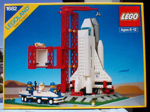
The first picture is the cover box for #1682 Space Shuttle from 1990, the very first Lego Town set to proudly display NASA's logo. After this, Lego created Space Port and the NASA logo did not appear again until 2003 in the Discovery/NASA line.

What still captivates me about these photographs is their ability to suggest stillness and action at the same time. The main picture shows you exactly what the box contains. No action graphics or other abstract "busyness." I'm especially fond of the shadow of the F-5 in the background on the left. Anyone who's ever watched a Space Shuttle come in for a landing knows this silhouette very well.

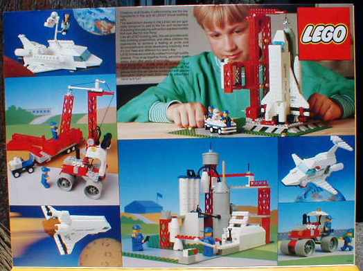
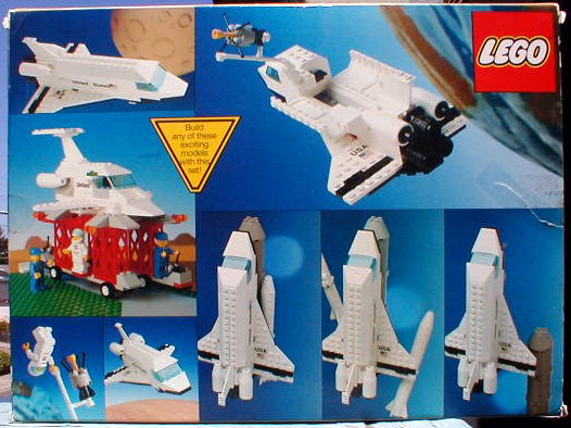
The cover flap and back cover photos not only show more play possibilities with the set once it's built, but also suggest quite a wide range of alternate building ideas, some of which aren't even space-oriented! Way to encourage imagination!
